Pantone's fun colour of the year— Living Coral
/ 2 min read
A look at Pantone's 2019 colour of the year, Living Coral, with recommendations on usage for branding and design
The fun and feminine Living Coral has been awarded Pantone's 2019 colour of the year:

#trending
Pantone's colour of the year is based on research into current colour trends across industries and cultures.
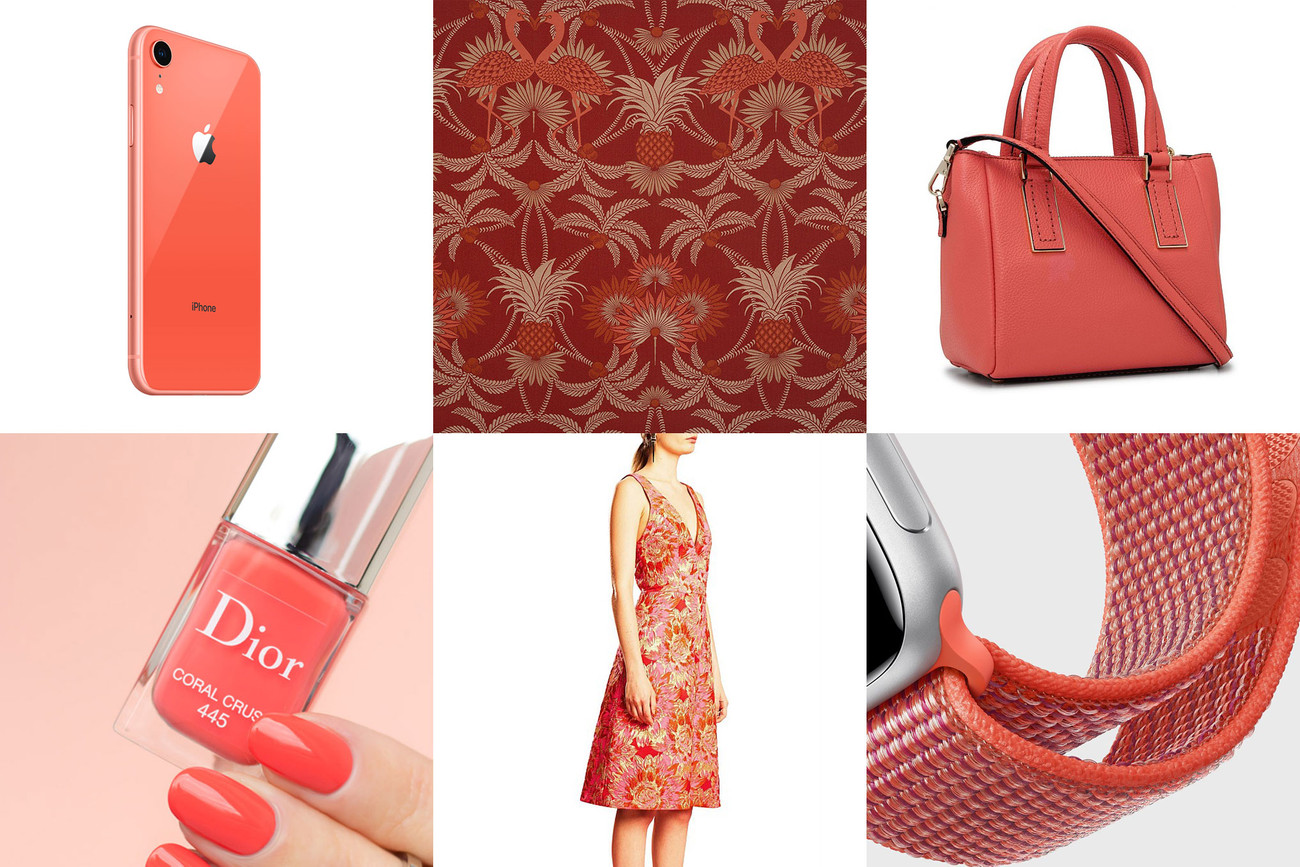
If you follow consumer tech, fashion or beauty you may have noticed a number of products recently adopting coral as their primary colour. It was probably Apple's most playful option from 6 new colours for the iPhone XR. It also featured in classic handbags from Kate Spade, Nail Polish from Dior, and fabrics by Mokum Textiles and Ginger & Smart.

Psychology
Colour psychology is hugely subjective and depends on context, but...
Sitting somewhere between orange and pink, coral combines ideas of vibrancy, energy, excitement, and fun. Pantone itself describes Living Coral as:
"vibrant, yet mellow... [it] embraces us with warmth and nourishment to provide comfort and buoyancy." —Pantone
It also has a definite feminine quality about it, evident in the examples above. For me, fun is a major vibe I get when looking at the Dior nail polish or Apple's Nectarine watch bands.
Design
When it comes to graphic design in branding, web or print, vibrant colours like coral are a great way to complement your brand's main palette. Accent colours can be effective in drawing the eye and driving behaviour. Call To Action (CTA) buttons on a landing page are a good example. A couple of usage guidelines when using bright colours or neons as an accent:
- A dark background can increase contrast, drama, and legibility
- Use sparingly for full effect (eg. a single CTA button, message, or image object)
Identities
We generally steer away from using on-trend colours like coral for logos. The goal is to create a company identifier that grows in the minds of customers over time. You want your logo to be just as relevant in 20 years as it is today. Think timeless rather than trendy. Legendary Italian designer Massimo Vignelli said of colour for logos:
"Most of the time we use colour as a signifier, or as an identifier. Generally speaking, we do no use colour in a pictorial manner. Therefore, we tend to prefer a primary palette of red, blue and yellow." —The Vignelli Canon
Combinations
When looking at other colours to pair coral with, a bright pink or green can create a high-impact yet fun and fresh combination. For a more subtle effect, a monochromatic palette can work well.


Happy mixing!